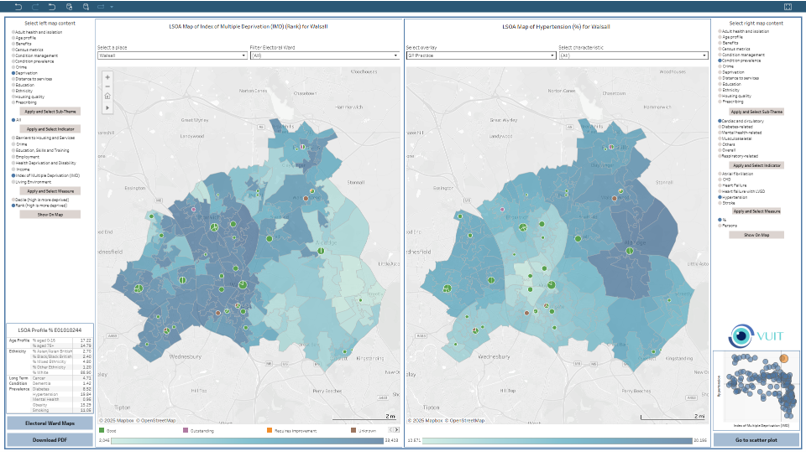
Interactive visualisations of key population health metrics which allow you to easily understand risk and opportunity within your communities:
- Displays areas of high and low population densities (count & %) around various themes, including:
- Deprivation
- Ethnicity
- Age
- Prescribing
- Long-term condition prevalence
- Adult isolation
- Benefits
- Crime
- Education
- Housing quality
Providing a holistic view of the defined population and covering the entire ‘Wider Determinants’ of Health.
- Ability to overlay hospitals, GPs, schools, care homes and more to identify provision close to areas of interest.
- Interactive tool for comparison of different combinations of population health-related indicators for each ICS/council footprint, enabling correlations to be identified and better decision-making to be achieved.
- Facility to download local indicators for further analysis or comparison with own data.
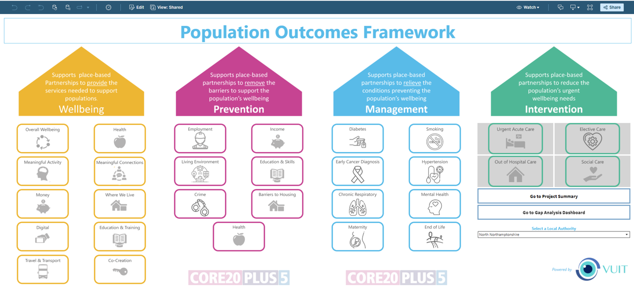
A full suite of tools to support needs analysis and commissioning of outcomes at a local level, and to then monitor the impact of delivery:
- Over 300 indicators organised into user-defined themes of wellbeing, deprivation, and long-term condition management — benchmarked across all local authorities, with local-level analysis where possible.
- Organised around the citizen and not the provider, and shown as trend and position Pareto analyses.
- Provision of a gap analysis to identify which outcomes are the best and/or worst performing — viewed nationally or versus peers.
- Tracks the progress of interventions, linking them to the outcomes they are designed to address.
- Provides oversight of system-wide programmes, and the indicators those programmes are planned to impact.
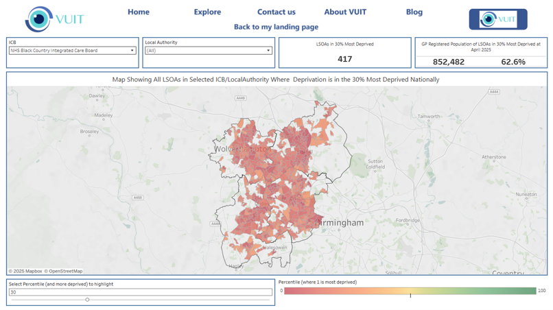
- Identifies specific LSOA (Lower-Level Super Output Area(s)) based on deprivation ranking nationally.
- Highlights LSOAs within an ICB or local authority footprint which are in the Nth most deprived percentile nationally across England.
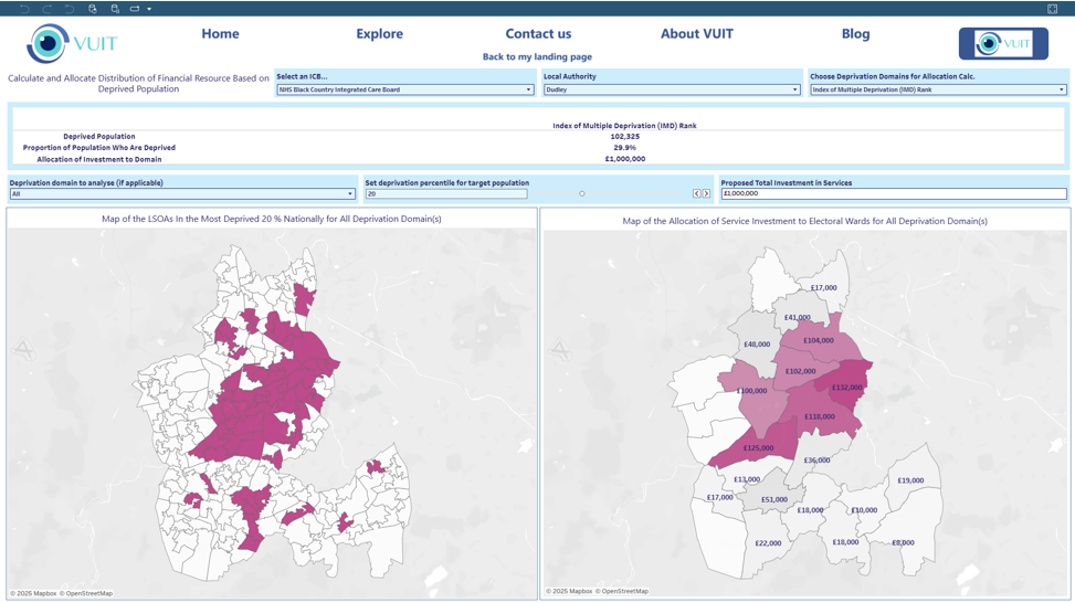
- Calculates this across any or all of the 7 domains of deprivation:
- Income
- Employment
- Education
- Health
- Crime
- Barriers to housing and services
- Living environment
- Provides a count of LSOAs within the Nth most deprived percentile nationally across England.
Interactive visualisations of key population health metrics which allow you to easily understand risk and opportunity within your communities:
- Displays areas of high and low population densities (count & %) around various themes, including:
- Deprivation
- Ethnicity
- Age
- Prescribing
- Long-term condition prevalence
- Adult isolation
- Benefits
- Crime
- Education
- Housing quality
- Providing a holistic view of the defined population and covering the entire ‘Wider Determinants’ of Health.
- Ability to overlay hospitals, GPs, schools, care homes and more to identify provision close to areas of interest.
- Interactive tool for comparison of different combinations of population health-related indicators for each ICS/council footprint, enabling correlations to be identified and better decision-making to be achieved.
- Facility to download local indicators for further analysis or comparison with own data.
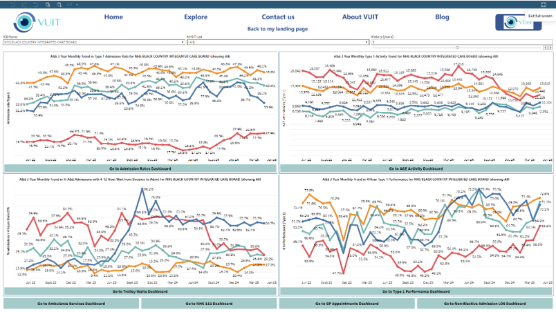
- Urgent and Emergency Care
- Cancer Wait Times
- Elective Wait Times
- Visualisations provide historic trends and current performance analysis for all NHS Trusts' UEC (Urgent and Emergency Care), RTT (Referral to Treatment), and Cancer key metrics.
- This includes visualisations of metrics related to other provider services such as NHS111, GP access, and ambulance services for UEC; and for RTT. For Cancer, we also visualise ancillary services such as diagnostic waits.
- Analysis is available at an NHS Trust or ICS level and includes benchmarking nationally and comparative trends against the national average.
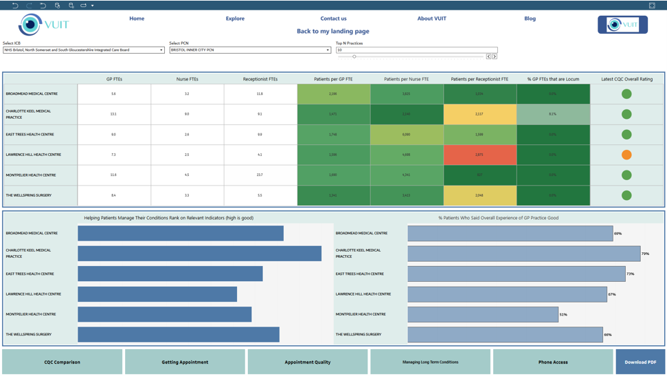
Rich analysis and comparison of primary care providers. Giving the user a high-level view of the practices in their Integrated Care Board or Primary Care Network. Practices can then be compared across a range of metrics including:
- Numbers and types of appointments offered per registered patient or GP full-time equivalent.
- Time taken to get an appointment and ease of getting through on the phone.
- The number of patients registered per GP and practice nurse full-time equivalent.
- The prevalence of certain conditions and how well the GP practice is performing in helping them to manage their conditions.
- The results of the annual GP Patient survey.
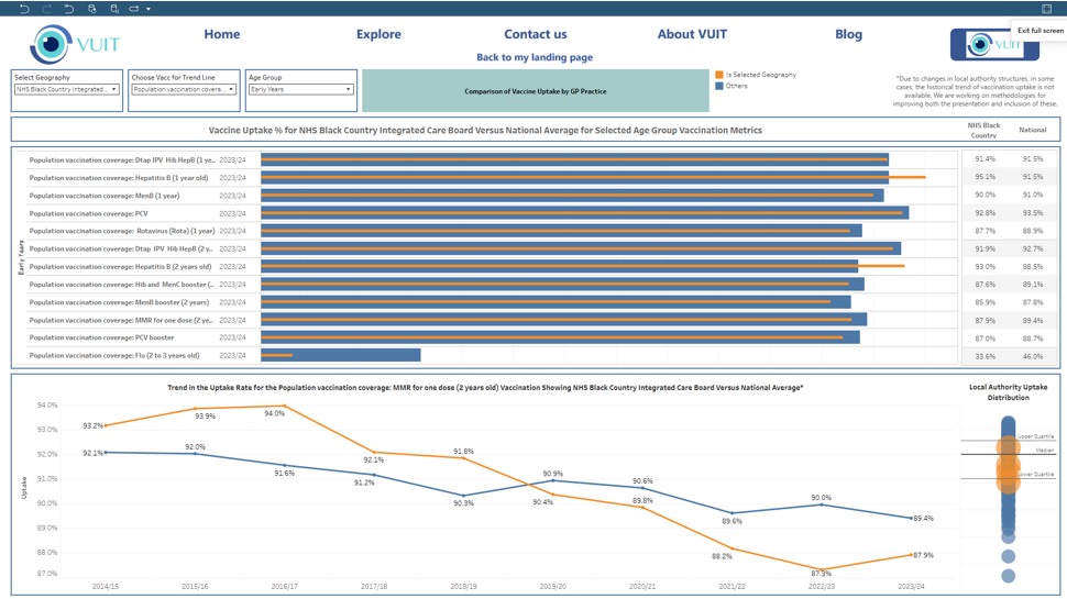
Provides analysis of vaccine uptake across groups of immunisations, including Early Years, Children and Adults, and Older People:
- Visualisations provide historic trends for the selected Integrated Care Board with comparison against national average uptake.
- Comparisons within the relevant Integrated Care Board population can be made, showing the selected immunisations by GP practice.
- This is presented as both a Pareto graph and also as a shaded map based on uptake, giving a hyper-local view of vaccine and immunisation activity, with the ability to overlay GP practices and/or schools onto the mapped indicator.
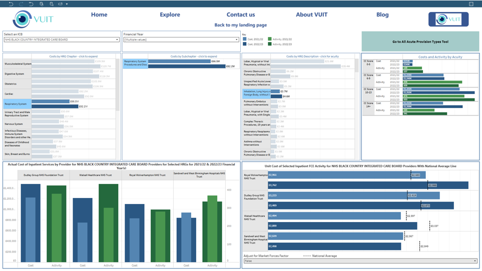
Interactive analysis of all NHS Trust activity and associated costs:
- Enables an Integrated Care Board to view fully attributed costs of all types of activity and benchmark cost and activity trends across providers.
- Supports drill down of inpatient activity by HRG chapter, subchapter, and acuity.
- Activity and cost drilldown is also possible by provision type, lead consultant specialty, and detailed description of the patient contact (or currency).
- Supports the identification of cost and activity outliers across ICB providers.
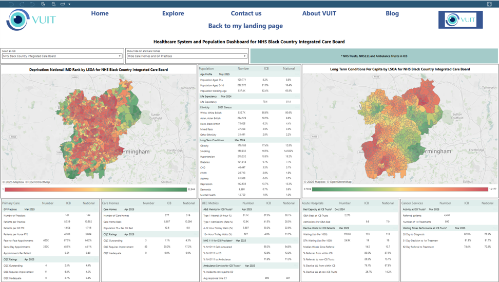
Healthcare system and population dashboard:
- Provides a population summary including age profile, life expectancy, ethnicity, and long-term condition prevalence, compared to a national average.
- The dashboard also includes a service activity summary across providers: Primary Care, Care Homes, UEC Metrics, Acute Hospitals, and Cancer Services.
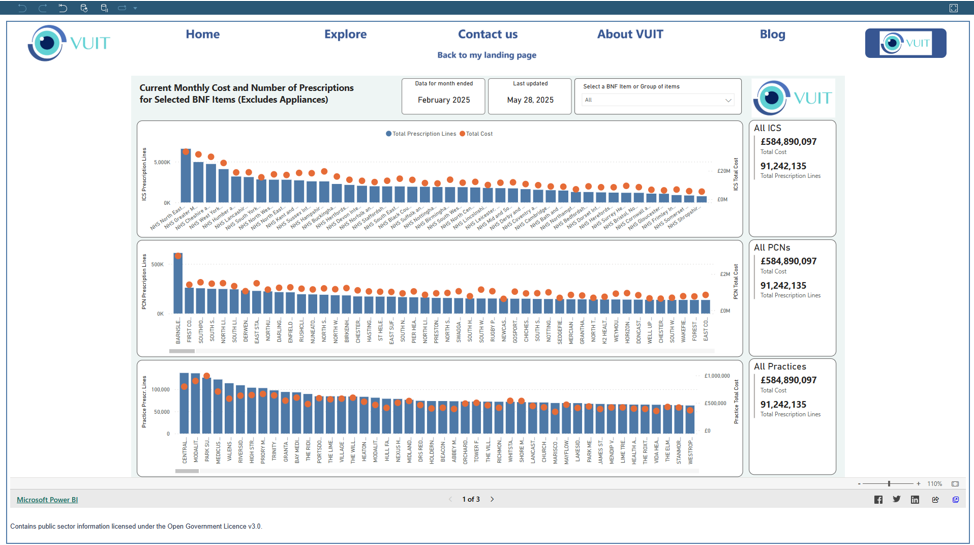
Prescribing data for Hospitals and Primary care:
- Presents the quantities of GP prescribed medicines and medical appliances, their cost, and the number of prescriptions issued. Presents the latest available values and trend analysis.
- Drill-down through the BNF hierarchy to individual medicines, strengths, and pack sizes or aggregate to groups of medicines e.g. antidepressants, ADHD medication, or HRT therapies.
- Select condition-specific medications and control for the number of patients on the condition register or 'all patients' to make prescribing comparable across different sized organisations.
- Compare prescribing to population characteristics, for example deprivation, age, and more.
- Organisational drill through and benchmarking for Integrated Care Board, Primary Care Network or GP practice.
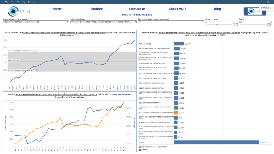
Analysis – Provides a high-level overview of mental health activity across a broad scope of indicators by Trust and by Mental Health Care Cluster, including:
- Trend analysis and comparison to national average, of around 200 mental health provider metrics.
- Comparison of mental health indicators for the selected Trust compared to other individual Trusts.
Inequalities tool: Located behind the customer's firewall to ensure Information Governance compliance, VUIT’s inequality tools provide the data feeds and dashboard to support integration with the customer's patient identifiable data from their Electronic Patient Record to allow Trusts to gain a deep understanding of the impacts of wider determinants, and equity of service on their demand profiles.
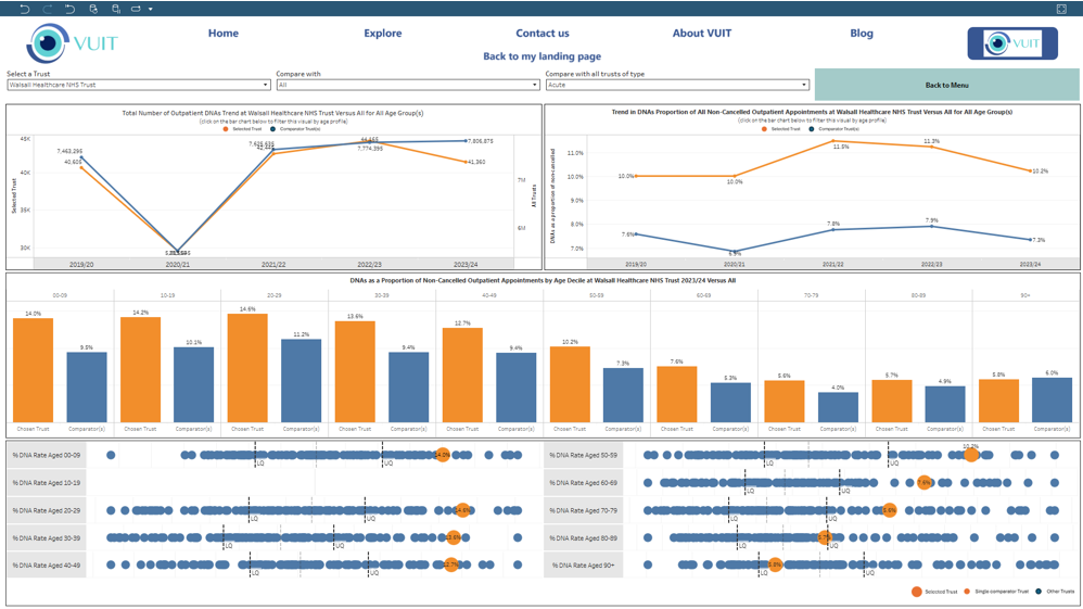
Provides visualisations and benchmarking of the last 4 years outpatient attendance metrics by NHS Trust, with functionality for comparison against the cumulative activity nationally or against other individual Trusts:
- Outpatient waits by specialty, attendances by age and specialty, DNA rates, appointment waits (same day appointments through to waits exceeding 18 months), appointment outcomes.
- Visualisations provide historic trends for each of the above analyses, including comparisons with individual Trusts or national activity.
